Introduction
Timeline: Mar 2022 - Dec 2023
Problem statement: The firm’s application landscape consisted of custom applications developed in silos. This lead to inconsistent and irritating experiences, used by business customer. Additionally, maintenance costs were also higher due to differences in technology stacks.
Goal: Merge the experience and the functionality of a web portal into single Swisscom business experience, while including new features.
Team: 12 full-stack developers, a product owner, a scrum master, 2 product managers and a customer care agent, 3 UX Designers
Roles played: Responsible for the overall product experience
Activities
- Interviews in a form of shadowing days
- Requirement engineering (Jira, Confluence)
- Interaction design (Figma)
- Prototyping (Figma)
- Usability testing
- Stakeholder management
- IT handover
Getting started
Challenges
Transitioning to the new portal required the reimplementation of over 30 complex use cases. We had to determine which functionalities to transfer, modify, and implement anew. Another challenge we encountered was outdated and excessively lengthy documentation. We aimed to address this as well.
Proposed solutions
We began with a table containing all existing use cases (we used Confluence) and the list of required use cases for the new service, Hosted PBX. Additionally, this document was used to set priorities and link design files. Following that, we organized a series of workshops to adjust the use cases based on stakeholder feedback. To tackle the challenge associated with documentation, we opted to exclusively use Figma. Rather than relying on written documentation, we designed and prototyped all crucial scenarios and added comments only when necessary.
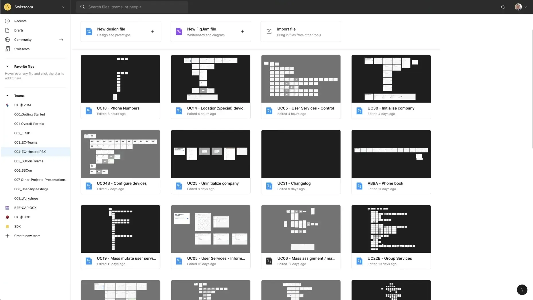
Hosted PBX Figma design files containing all essential use cases
Lessons learned
Developers appreciated the brief documentation and clickable prototypes. With the help of Figma’s design libraries, we created rich design documents with speed. We learned to architect design files with components and variables in mind. In the following pages, I detail a few selected changes we made on Hosted PBX.
Redesigning the phone numbers table
Previous version
According to Adobe Analytics and user feedback, the table displaying phone numbers has emerged as the most frequently accessed page. Through conversations with users and customer care representatives, we have pinpointed several areas of improvement:
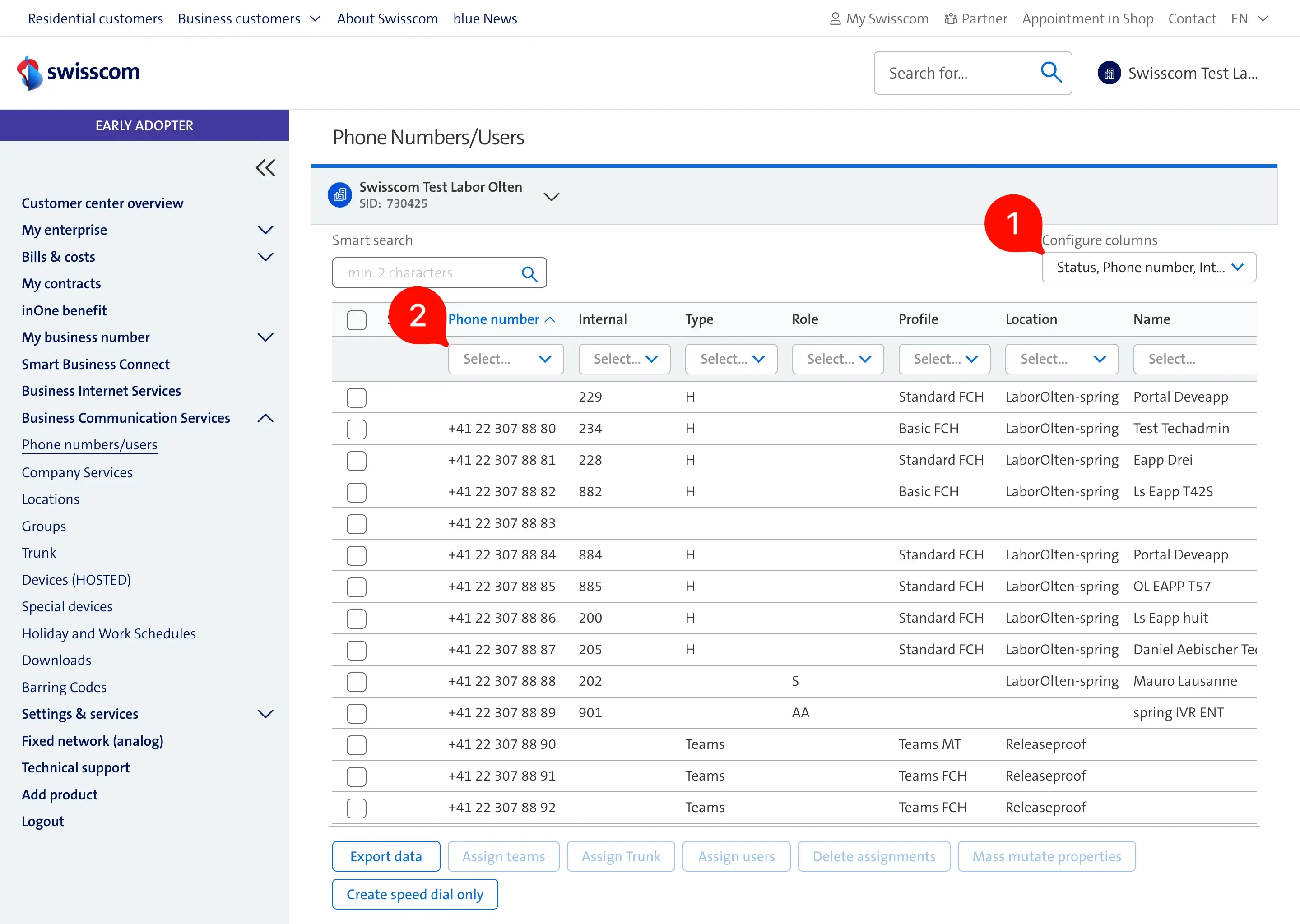
- Column configuration - user settings are not stored between sessions; therefore, users stopped using them.
- Column quick filters - our analytics shows that the “Smart search” is used over the column filters due to its performance and capability to search across the entire table.
- All table actions are always visible, and they are displayed in two rows. This takes up space from the phone numbers table. Users have difficulty learning what options they have with the current selection.
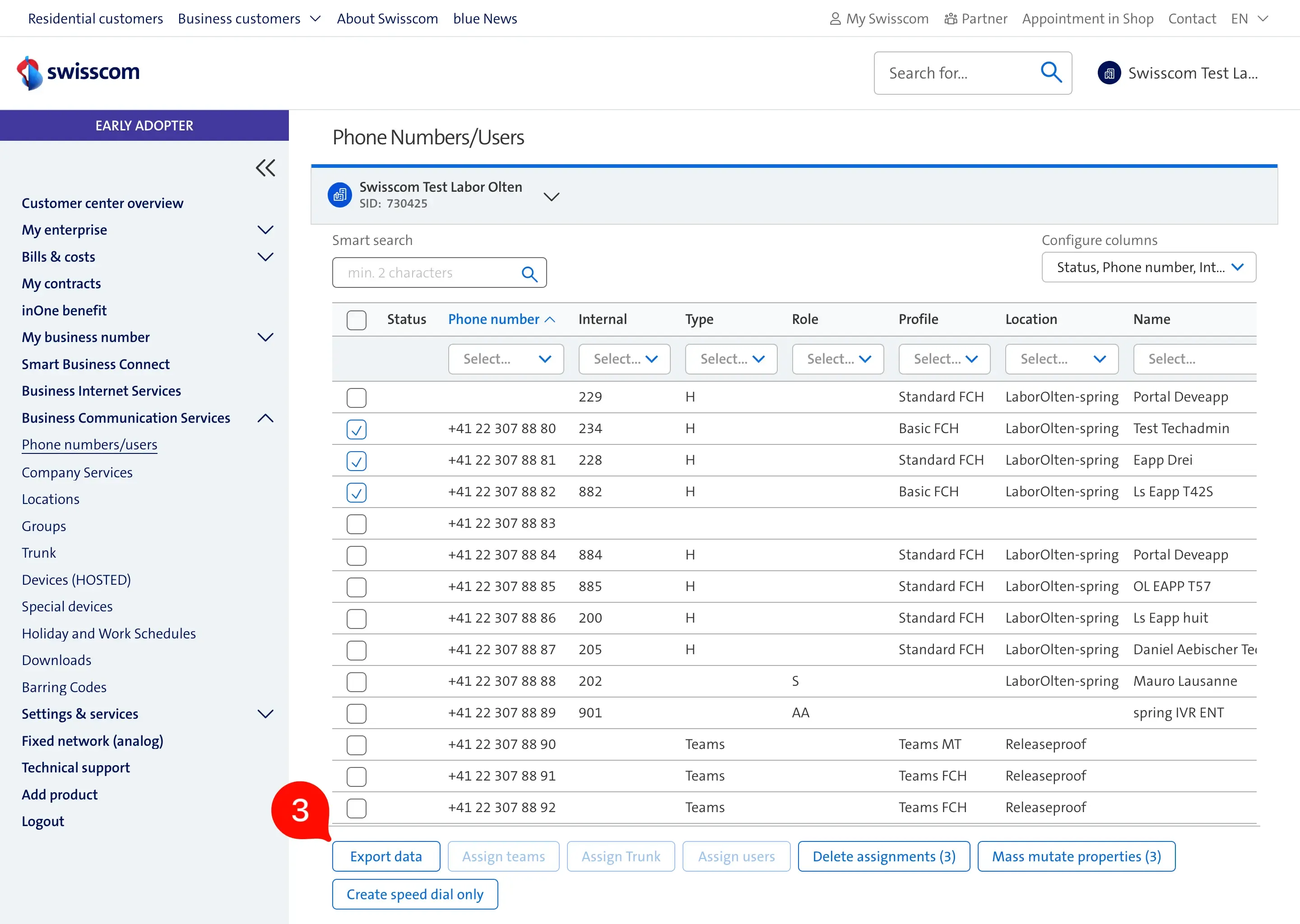
- The total /selected items, together with pagination settings, are only visible after the user scrolled to the end of the table. Most of the users never discovered this section.
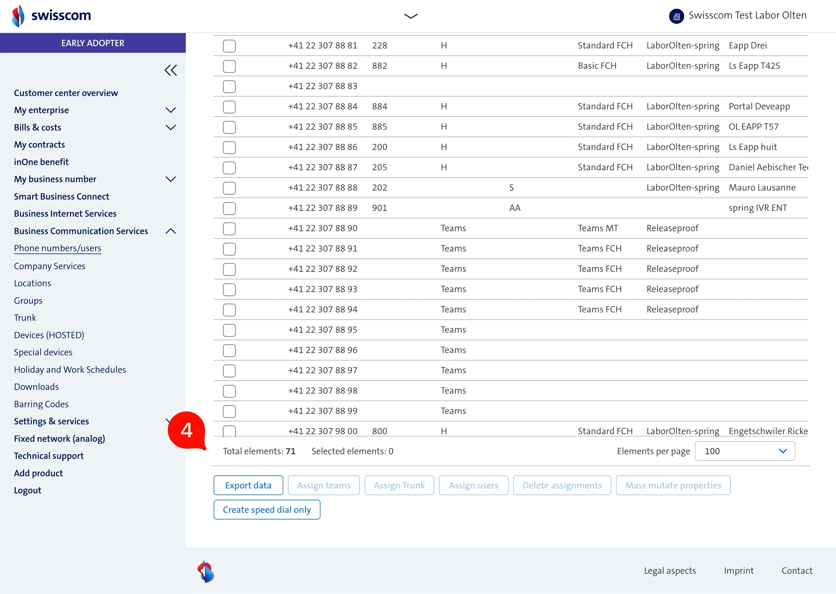
Temporary solution
As a quick-win towards better usability we made the following table improvements:

- The two rows were consolidated into a single row, displaying only the actions pertinent to the current context while concealing everything else.
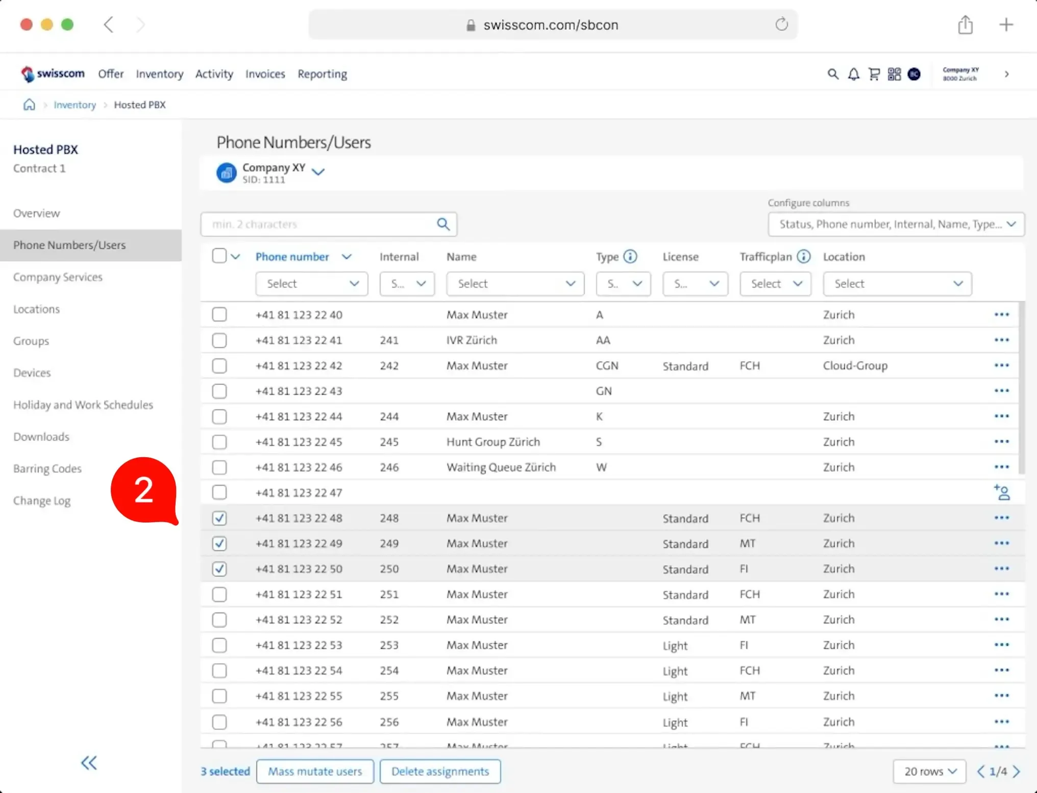
- When phone numbers are selected, the footer shows only the selected items and possible actions with those items.
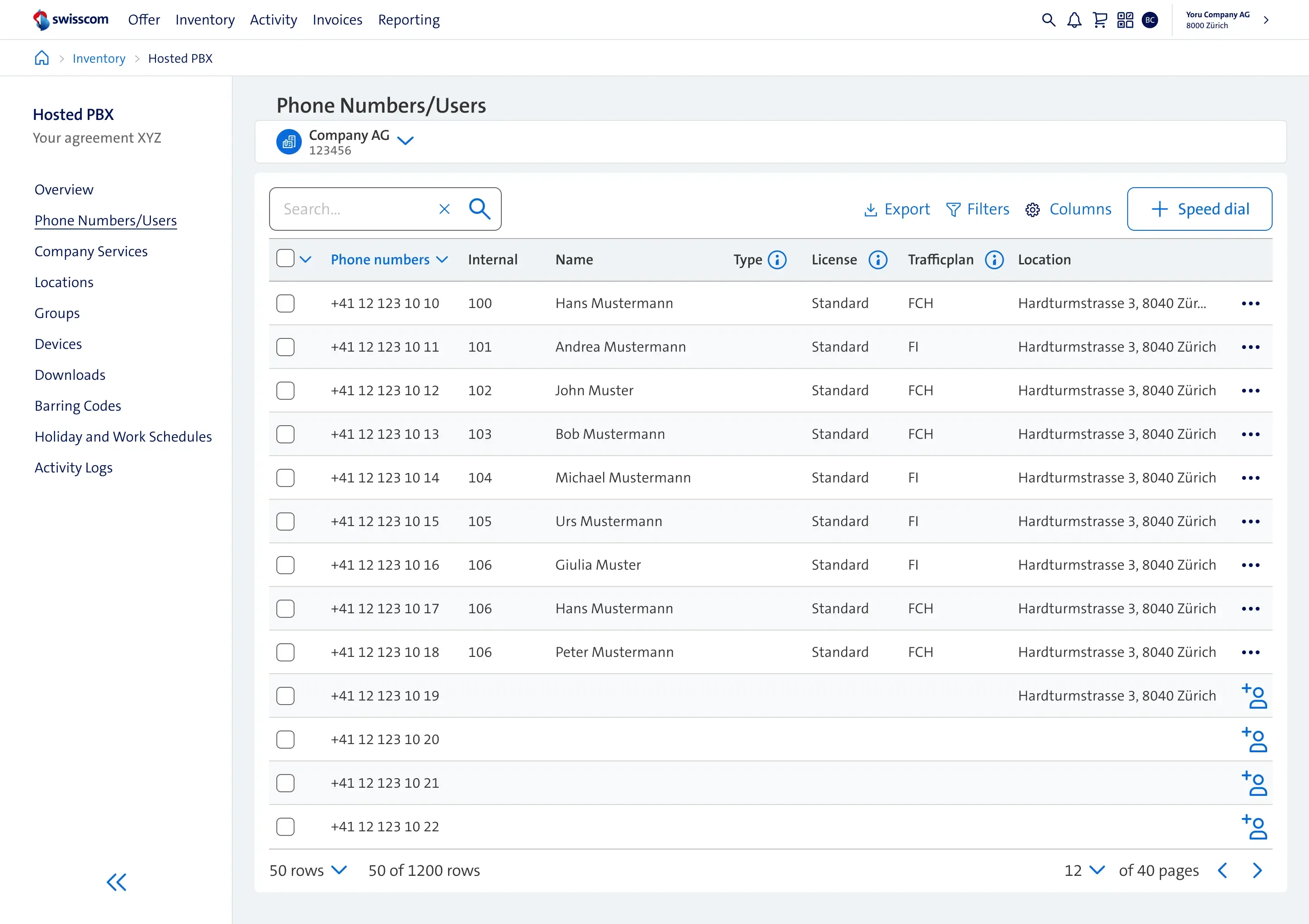
Final design
The result of the ideation session, usability testing and alignment with other UX teams.
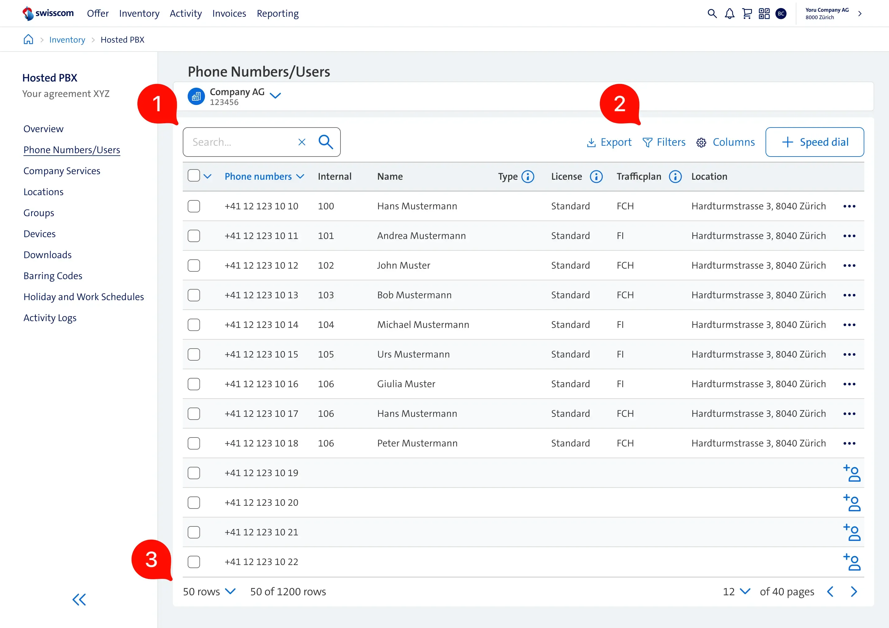
- Search bar - remains the main action due to it’s high usage
- Table Actions, exports, filters - actions related to the table content were moved to the top-right area of the header. Inspired by the Carbon Design system from IBM.
- Table footer - contains only generic table actions like pagination.
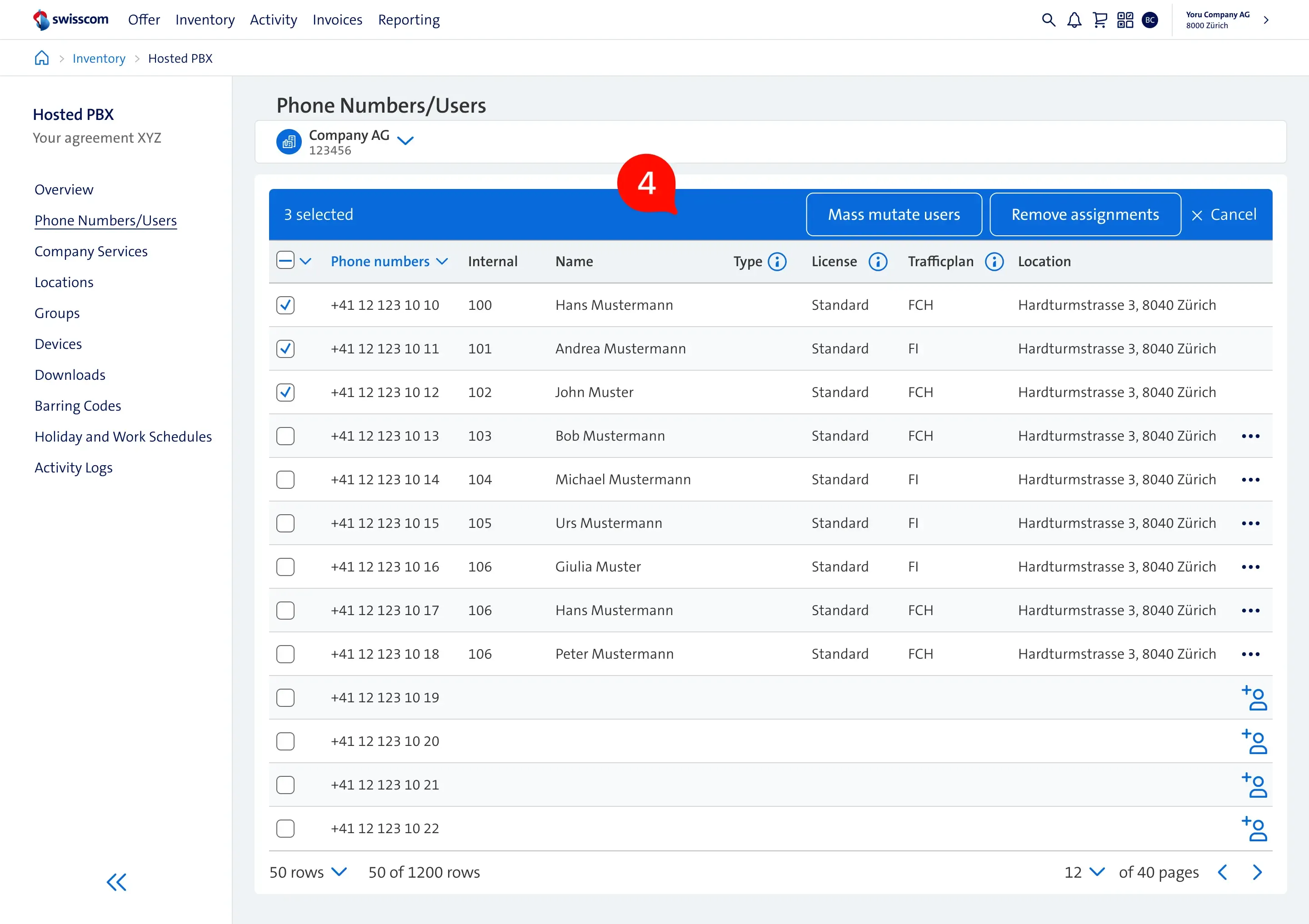
- When phone numbers are selected, the header conceals search and additional actions, instead emphasizing the actions that are currently available based on the given selection.
Redesigning the services overview
Previous version
The web application provides advanced functions to users throughout the services overview page. There are different services for the company, groups, devices, and users. These services are critical to change settings like call forwarding, do not disturb, and many other telephone configurations. The following issues were identified:
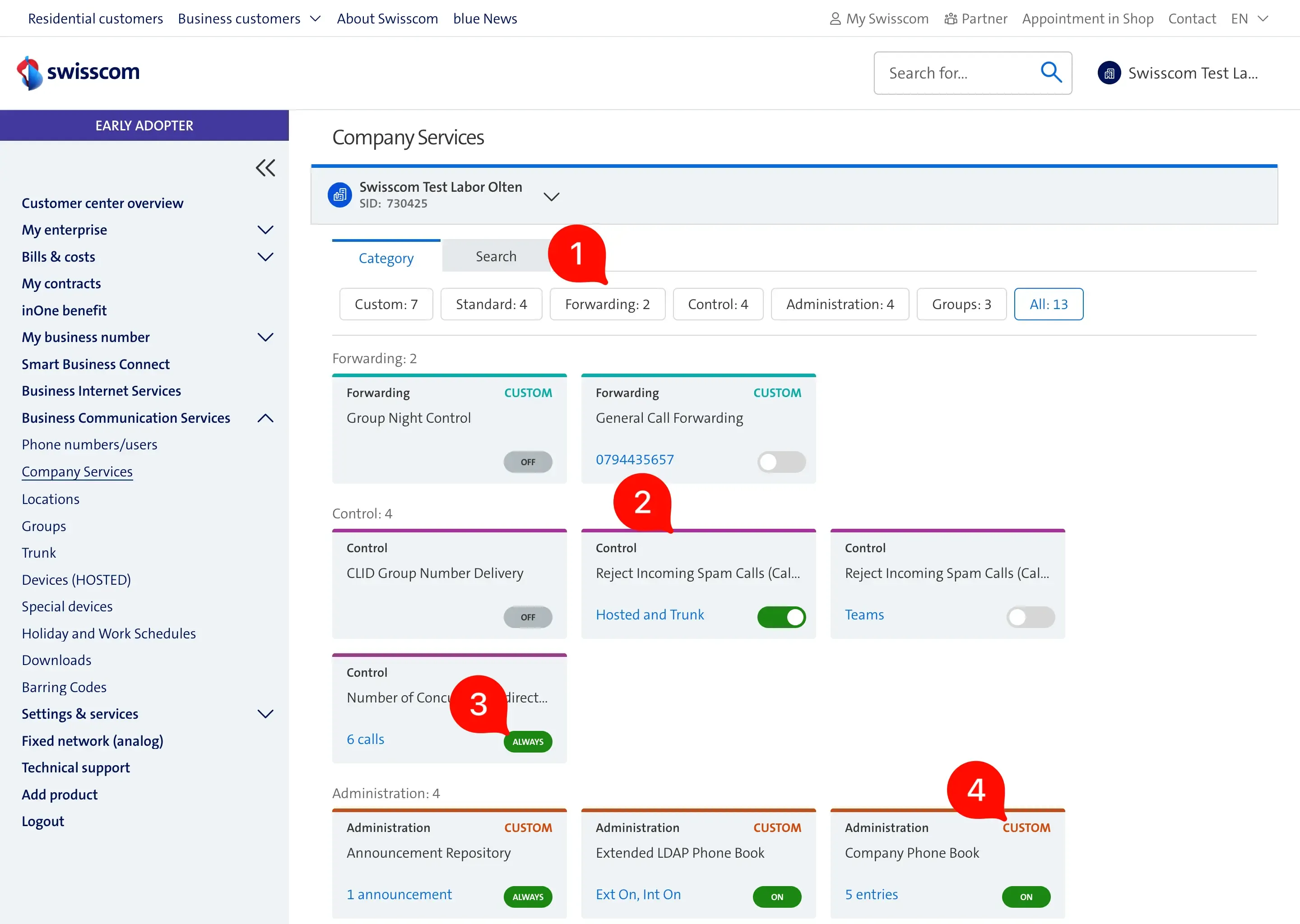
- Most of the users use the built-in browser search as it is more convenient than switching to the search tab, selecting the search input, and starting to type.
- The layout for the most commonly used screen size has 3 columns. Because of this, users see only a few services at a time.
- Too many service statuses make it hard to understand and remember them.
- The service category titles are displayed redundantly.
Final design
Once we consolidated all the stakeholder and user feedback, the final iteration looks the following:
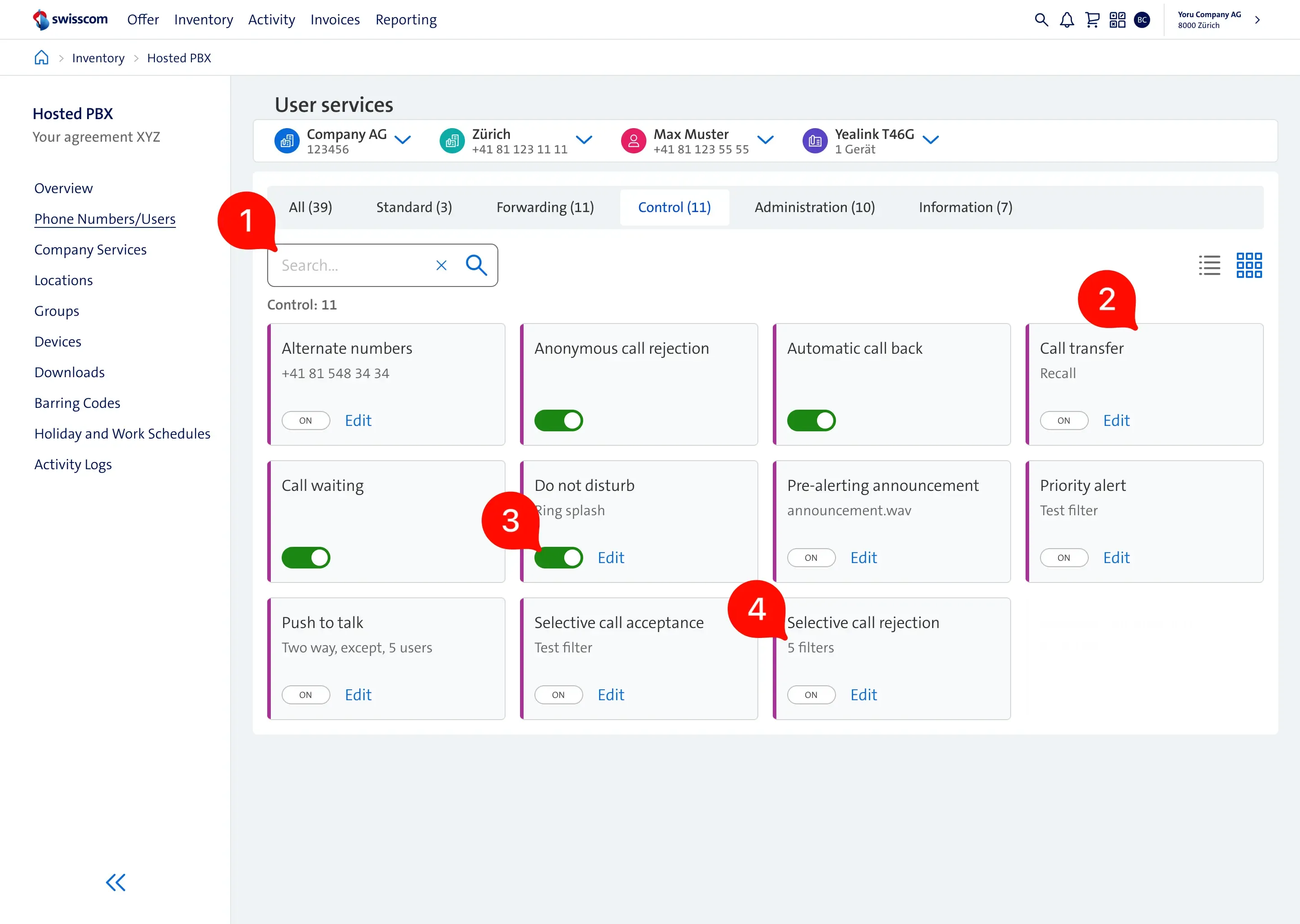
- Search field moved next to category filters.
- For the same resolution, we now provide 4 columns, which makes the page compacter and allows us to display more services at once.
- The service status was refactored to contain only 3: off, on, and a toggle.
- The cards contain only relevant information without additional noise.
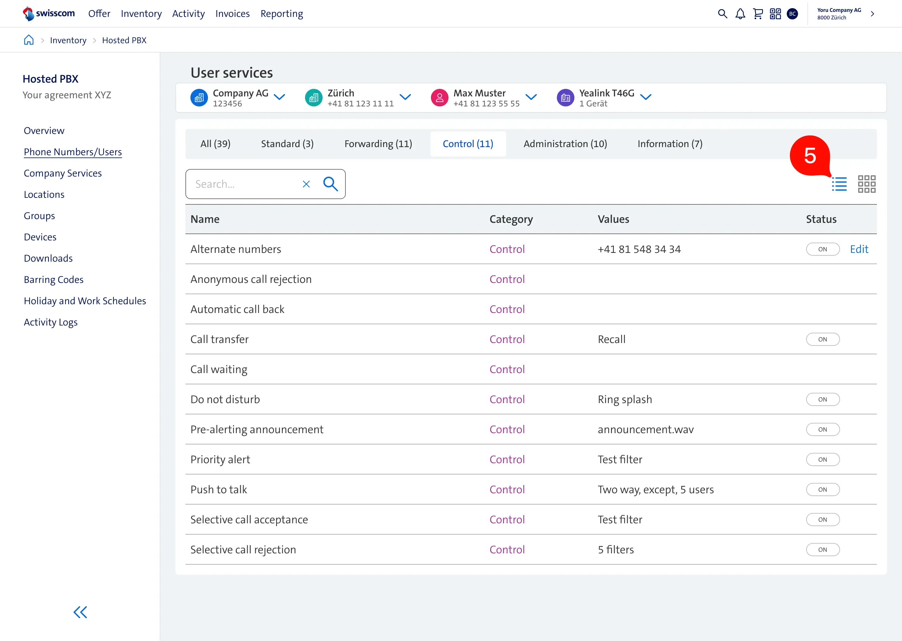
- We introduced a new view, as some users preferred the classic list view due to readability.
Redesigning the announcement repository
Previous version
Compared to the phone numbers table, user infrequently modified the announcements. Conducted usability testing revealed few usability issues:
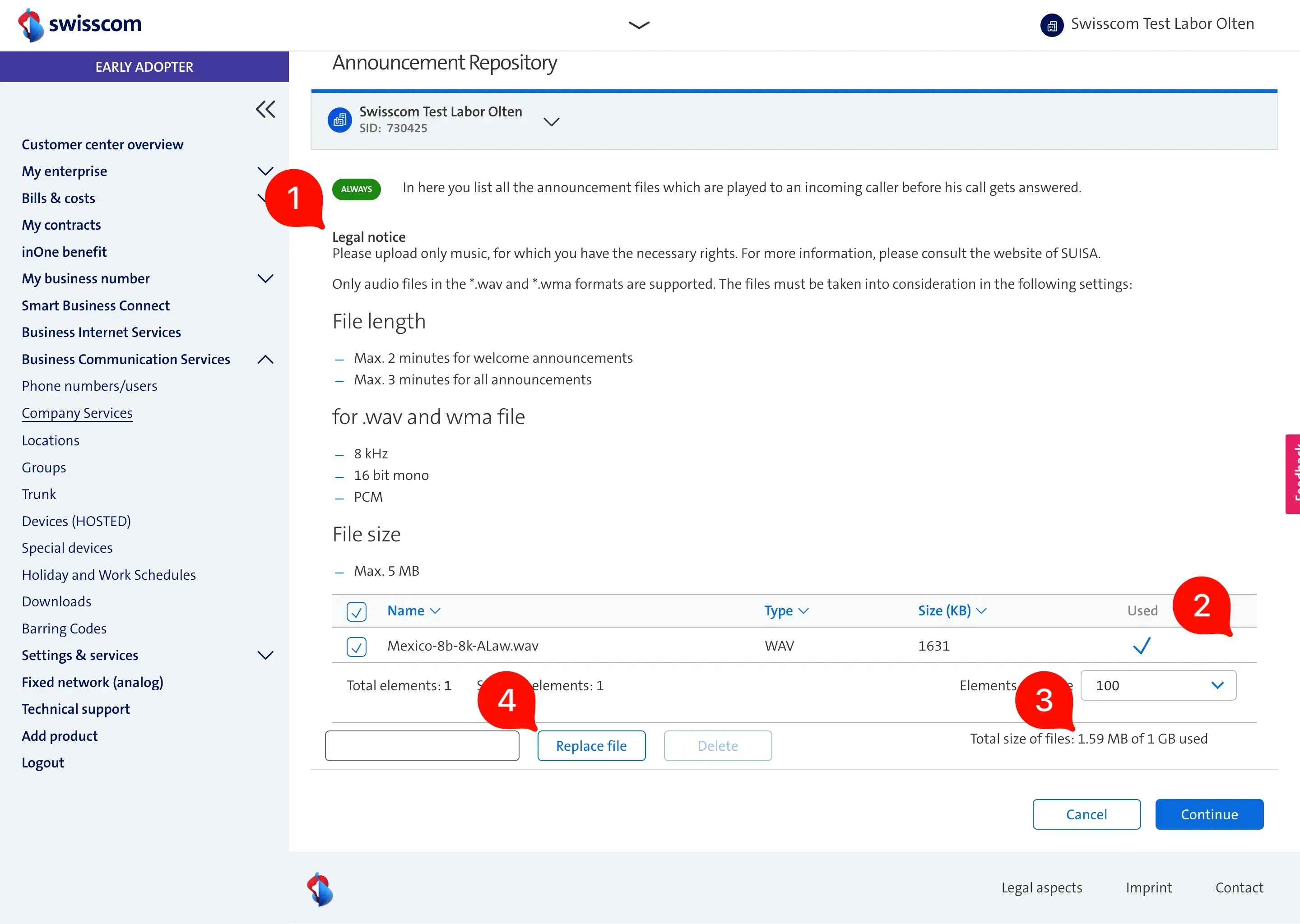
- Legal notice and information about file requirements are taking up too much space. The most important part, where users manage the files, is at the bottom of the screen.
- We learned that users want to download the announcement files to reuse them for other companies or they wanted to have a backup. This was not possible.
- The site displays 3 different file units (kB, MB, GB), which is confusing for users.
- When an announcement file is used in several places and if it needs to be updated, the replace feature can simplify this task. However, most of the users did not know about it as it is hidden.
Final design
Apart from improving the usability, we made it modern. We experimented with a new layouts and we settled with the card layout:
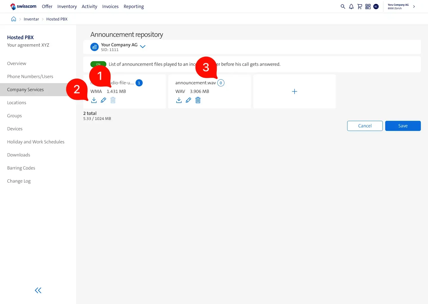
- File size unit is now expressed in a single format.
- Users can download, replace and delete announcements.
- We extended the usage information. The badge shows how many times and where the announcement is used.
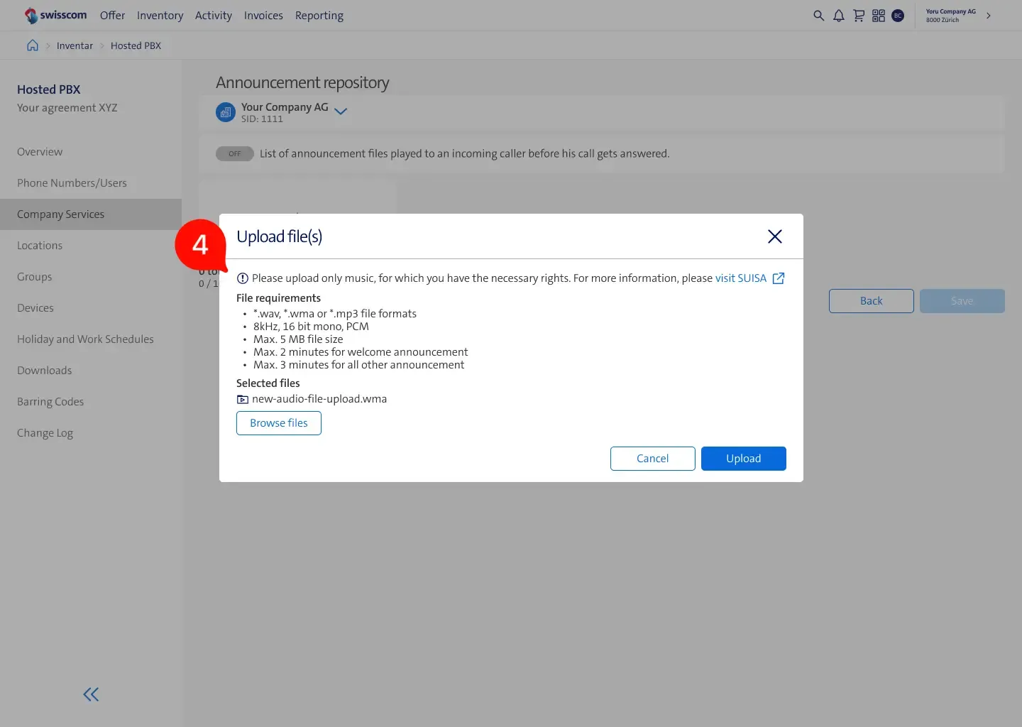
- Moved the legal and file requirements related information into a modal, right before the upload happens, this way users see this information when required.
Conclusion
Impact
The technology stack and user experience have been aligned with the firm’s overall guidelines, resulting in users reporting shorter times to find information and set up telephones for their customers. I lacked access to detailed analytics of the new system, which prevented me from providing specific improvements to the figures.
Collaboration
Part of the development team was located in near-shore location, which required us to regularly visit them and communicate the vision of the product. Throughout the project, we performed 2 full-day design thinking workshops, involving software and hardware engineers, business stakeholders, and users. Thanks to the relationship with key partners, testing hypotheses was as simple as setting up a video call.
Reflection
Using Figma as the primary documentation tool had some drawbacks. It necessitated versioning design files and architecting components in a manner that ensured easy maintenance. This project was in a unique position, as customer care agents and a large number of users were open to collaboration.